Design system, a bridge between UI and UX
These days, owning websites and applications is vital for businesses because they can showcase their products and deliver better services to their customers through those platforms. Therefore, it is important to design them following the latest standards in website and application design. Benefiting from a UI/UX design system helps developer teams perform harmoniously or systematically while creating or developing a website or application or even both. In this article, we have a deeper look into the design system in the UI/UX section and how it can be helpful in a business.
In this article, you will read about:
- Introduction to system design in UI/UX
- Why is a design system in UI/UX important?
- What are design system components in UI/UX?
- Do you need a UI kit or a design system?
- Brand archetype effects on a design system
- UI/UX design system platforms
- How can a design system perform like a bridge between UI and UX?
- Is there a relationship between a system design and SEO
- Conclusion
Introduction to design system in UI/UX
A system design in UI/UX is a collection of a guided website or application graphic design with all the components and styles used in the design, so developers can work following the design system cohesively and consistently. A design system should consider User Experience (UX) and User Interface (UI) to ensure that a website or application is accessible to all types of users (UX) while maintaining its pleasant user interface (UI). There is always detailed guidance in a design system which helps developing teams better understand and then follow the instructions.
Why is a design system in UI/UX important?
There are some important reasons for which we prefer to have and follow a design system:
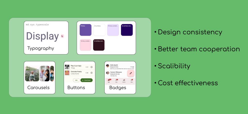
Design consistency
Design system in UI/UX guarantees that products including websites and applications behave consistently and in an organized way on different platforms. Consistency in the design system means benefiting from identical colors, typography, patterns, and so on.
Better cooperation between designing team members
Design systems help designers, developers, and every other individual who is engaged in website or application development work on a stable path without violating the mentioned rules and instructions in the design system.
Scalability
By using a design system, the design development can be observed and managed easier, especially in big projects. When you need to make some changes or add some new features to a website or application project, you do not need to design components from the beginning, when there are libraries of components and styles in your design system to go with. In addition, with a design system, you can save more time and energy.
Cost effectiveness
Preparing a design system surely needs a financial investment and a great effort, but looking from an overall perspective, it can be cost effective because, in a long time, there is no need to spend time and money on redesigning and testing like the first day.
What are design system sections in UI/UX?
A design system contains different components which are going to be introduced here:
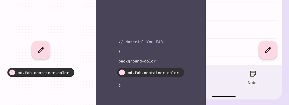
Design tokens
Design tokens are a library of reusable styles where all style choices and changes are kept and everyone who works on the designing project (developer or designer), is sure that they follow the same style in their work by respecting the design tokens.
In other words, design tokens are the repetitive styles that are used all over the design system. Design tokens help the consistency of the whole design system. By having them, the design project will have the same appearance in every tiny part. The value of design tokens can be buttons, font families, font weights, colors, borders, etc. A design token consists of two parts:
- A name like a code
- A value attributed to that name
For example, in the image below, md.fab.container.color is a design token with attributed color #ffd8e4. Where this token is used, that part will have that color.
UI component library
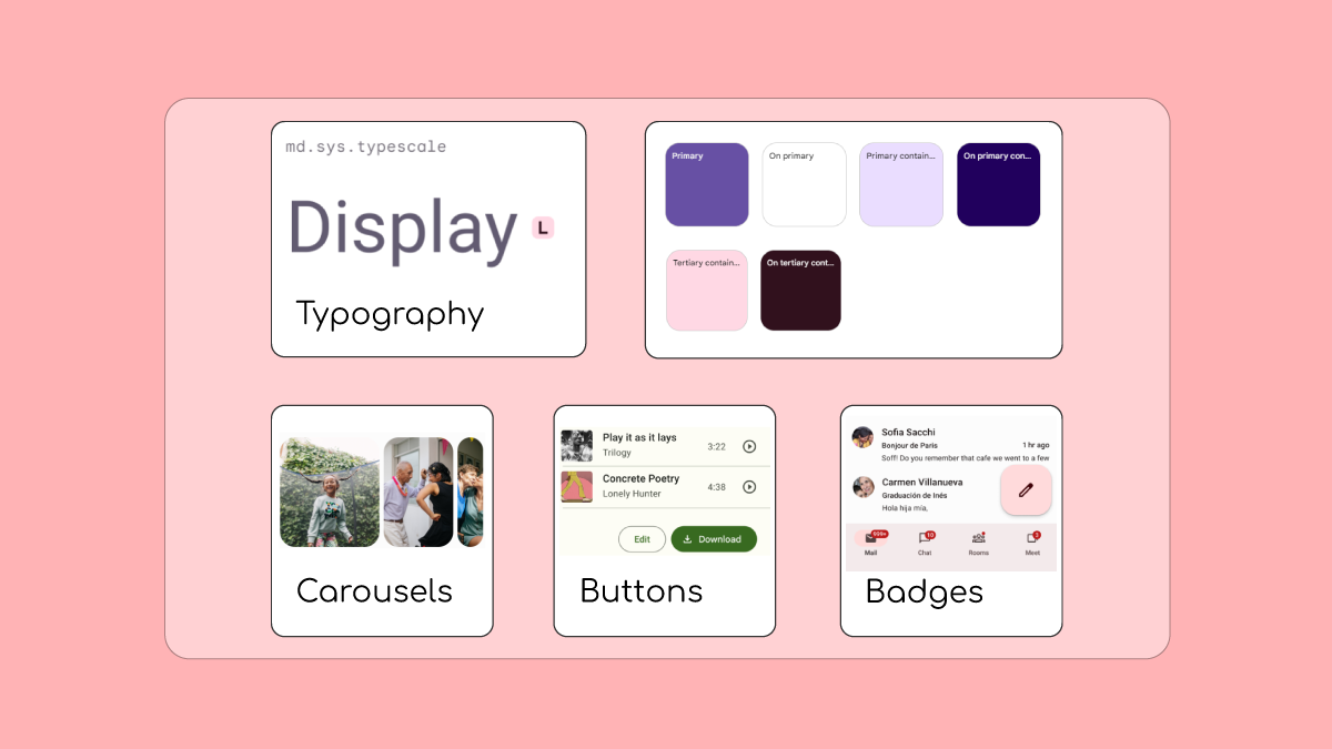
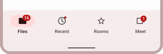
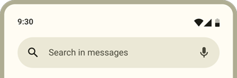
A User Interface (UI) component library (or a UI kit) is a collection of all components that are used throughout the project design and development. Examples of UI components include:
- Icons
- Logos
- Cards
- Carousels
- Badges
- Navigation drawers
Pattern library
Another part of a design system in UI/UX is the patterns library. Patterns are combinations of different components. As an example, a form (eg. contact form) is a pattern containing fields, buttons, and labels. By defining a form as a pattern, wherever you need to add a form through your design development, there is no need to add each form piece separately. You can easily use the form pattern.
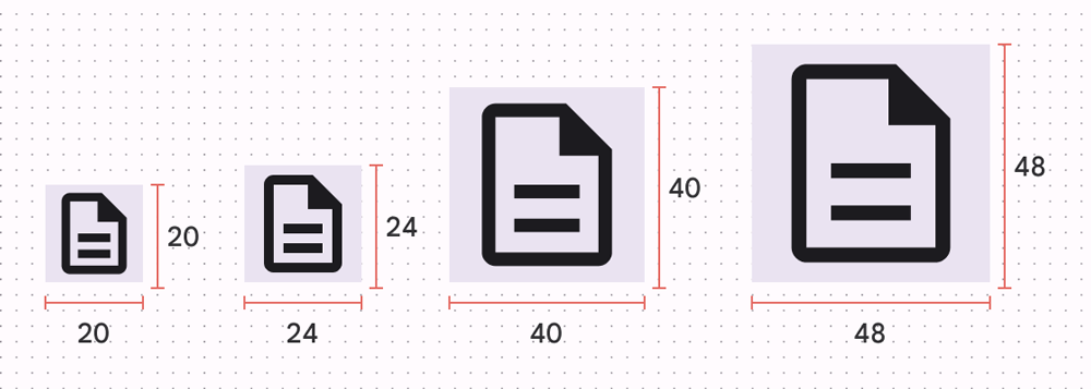
Icon library
An icon library is a collection of all reusable icons and symbols through the design project. Some information like the icon’s size and weight are included in this section.
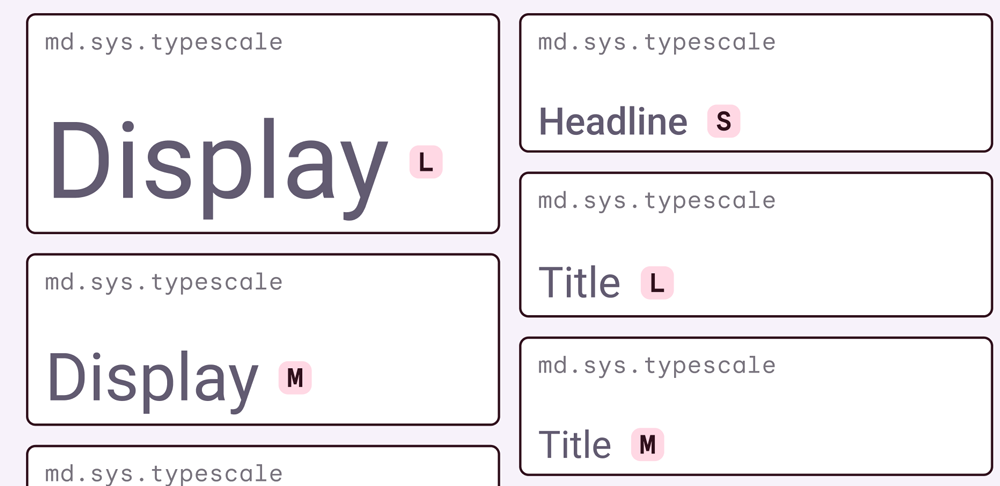
Typography
Another part of a design system is typography which makes text readable and nice. Typography includes information about type styles and their hierarchy, size, line height, font weight, and letter-spacing. To apply typography, it is recommended to use variable fonts because you can have better control over them as they are customizable without the need to load different font files. Types scales are a collection of different font styles that can be used all over a product. A Type scale contains information about a font style including its font family, size, weight, and line height which are all defined throughout design tokens.
Brand principles and guidelines
Brand values and guidelines contain main goals of the company and how would be users’ feelings when interacting with your product(s) like website or application. In fact there are all the rules and principles that are vital for the business brand and should be followed in all steps of designing and project implementation. They are helpful as they provide a clear and consistent path for designers and developers to move in the right way.
For example, Apple‘s brand values are simplicity, innovation, and elegance and the brand’s principles are focused on minimalism, balanced colors, and accessibility. Both values and principles can be easily observed all over their product designs. Google has another successful brand value and principle. Its most important value is providing the best user experience along with speed, simplicity, and high efficiency. Google Material Design is a sample of brand values and principles reflections. There are simple and realistic designs while considering different graphic aesthetics aspects, which all provide a great user experience.
Designing guidelines
Design guidelines are a set of rules that specify the main design goals that should be considered during the design process. For instance, a design principle can be “Keep simplicity while attracting attention”. So, all team members try to follow the simplicity’s instructions and key features, when trying to create a design with the appealing appearance and pleasing user experience in order to meet the design principle.
Accessibility guidelines
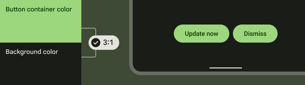
There are many individuals with disabilities including blindness, vision problems, hearing difficulties, and physical or situational impairments around the world. Therefore, different standards have been defined by governments under the title “Accessibility guidelines”. Web Content Accessibility Guidelines (WCAG) is one of the important guidelines which contains detailed information in web content, so they can be accessible for people with mentioned impairments.
Accessibility is one of the vital points that must be considered in a UI kit or design system. Accessibility guidelines provide necessary information and standards which concern all groups of people. These rules should be considered during designing and coding processes. In fact, all users with or without mentioned conditions should have the same experience when visiting a website or using an application.
Accessibility score can be measured through tools such as Google Lighthouse or Accessibility Insights for Web Chrome extension.
Here are some accessibility items examples that are audited in mentioned accessibility measurement tools:
- Contrast ratio of background and foreground colors
- <title> element of documents
- Image alt attribute
- Button and link names
- Font size
- Tap element sizes
- Tap element distance
- Focusable elements
- ARIA labels
- Date pickers

You can also read “How can the contrast ratio have an impact on SEO?” which explains the contrast ratio as a web accessibility factor in detail.
Content designs and guidelines
Content guidelines and designs are practical information about how to provide content to be easy to read and understand by everyone. This information covers both conceptual and visual aspects. For example, to write an alt text for an image, you need to focus on what the image is about, so all the users including the ones using screen readers can understand what the image is about.
Do you need a UI kit or a design system?
UI kit or UI component library is a part of a design system, but it can be used alone. UI kit is a good choice for small projects that only look for an organized system, but not a complicated one. This is while a design system is necessary for big projects which are mostly complicated and have different products inside such as a website, an application, and a dashboard.
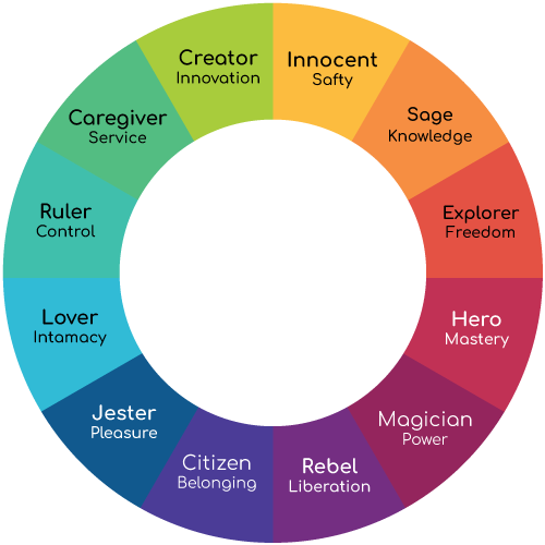
Brand archetype effects on a design system
Archetypes, which were introduced by Carl Jung, are the general human characteristics in which groups of people have almost the same behaviors. These archetypes are used in UI/UX design as they can have a considerable impact on a product design identity and orientation, and can help create a recognizable and consistent brand identity. There are 12 archetypes:
- Innocent
- Sage
- Explorer
- Hero
- Magician
- Rebel
- Citizen
- Jester
- Lover
- Ruler
- Caregiver
- Creator
UI/UX design system platforms
There are various popular UI/UX platforms available that can assist you in creating structured design systems.
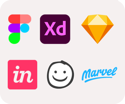
| Features | Figma | Adobe XD | Sketch | InVision | Balsamiq | Marvel |
|---|---|---|---|---|---|---|
| Good for beginners | ✔️ | ✔️ | ✔️ | ✔️ | ✔️ | ✔️ |
| Offline working | ❌ | ✔️ | ✔️ | ✔️ | ✔️ | ❌ |
| Responsive designs | ✔️ | ✔️ | ✔️ | ✔️ | ✔️ | ✔️ |
| Prototyping | ✔️ | ✔️ | ✔️ | ✔️ | ✔️ | ✔️ |
| Developer tools | ✔️ | ✔️ | ✔️ | ✔️ | ✔️ | ✔️ |
| Plugin | ✔️ | ✔️ | ✔️ | ❌ | ❌ | ❌ |
| Different format | Limited | ✔️ | ✔️ | ✔️ | ✔️ | Limited |
| Leave comments | ✔️ | ✔️ | ✔️ | ✔️ | ✔️ | ❌ |
| Free | ✔️ | ❌ | ❌ | ✔️ | ❌ | ✔️ |
| Premium | ✔️ | ✔️ | ✔️ | ✔️ | ✔️ | ✔️ |
How can a design system perform like a bridge between UI and UX?
Design systems help to bridge UI and UX by harmonizing the visual and functional aspects of a design project. This integration guarantees that the product is pleasing and user-friendly from a visual aspect and it performs well from a functionality aspect. By benefiting from a design system, a consistent and reusable library of components and a set of rules are created that can be used in a UI design and UX designers ensure that these components and rules are used in a way that provides the best user experience in all devices such as desktop, tablet and mobile devices and different platforms like the website or application.
Is there a relationship between a system design and SEO
Yes. A good user experience (UX) and nice appearance (UI) of a website can impact users’ behaviors by keeping them for a longer time on a website which can cause an increase in the conversion rate. Therefore, a design system or a UI kit helps to have harmony and elegance all over the website’s pages and elements which has a considerable effect on SEO.
In addition, by using a design system or UI kit, thanks to the ready-to-use components, there is no need to have long and unoptimized codes, so codes will be more optimized in comparison with the situation of not using a design system or UI kit. As a result, it can have a positive impact on each page’s performance.
The faster a page loads, the more time the user may spend on the page, the more pages he will visit, and the more conversions may happen.
Conclusion
Design system is an integrated system which contains both the appearance and user experience of a product. By benefiting from a design system, we can anticipate a well-managed and consistent project that all the developing parts (designing and coding) work in the same and right path.
📚Resources: