Web accessibility is one of the important on-page SEO signals that may be less valued. “Contrast ratio” is an accessibility subset that provides readability on the texts for all people, even those with color recognition or some vision problems. In this article, you can find detailed information about contrast ratio on the web.
In this article:
- A brief history of the contrast ratio
- Why is the contrast ratio important?
- How is the contrast ratio calculated?
- Contrast ratio with AA/AAA standard
- Contrast ratio with APCA standard
- Low contrast ratio text recognition
- Color blindness emulation in Google Chrome DevTools
- Summarize
A brief history of the contrast ratio
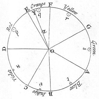
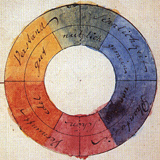
It is interesting to know that Isaac Newton calculated the contrast ratio of 7 colors in 1704, and designed a color circle for them. Based on this color circle, every two colors which were positioned opposite each other, had the highest contrast ratio. Later in 1708 Johann Goethe, the well-known German writer, created another color circle with 6 colors included, but he did not use mathematical calculations like what Isaac Newton had done.
Why is the contrast ratio important?
Based on the statistics, about 320 million people around the world, 1 man in a 20-male population and 1 woman in a 200-female population are suffering from color blindness and vision disabilities. So, it is essential to provide suitable conditions on the web pages for all to be able to read the content on websites. For this purpose, Google suggests considering the Web Content Accessibility Guidelines (WCAG) standards regarding accessibility and color contrast ratio.
How is the contrast ratio calculated?
One of the valid color contrast ratio standards was created by the World Wide Web Consortium (W3C) based on the WCAG. The color contrast ratio is calculated based on the level of background and foreground colors’ luminance. The white color has a luminance of 100% and the black color luminance is 0%.
contrast ratio = (L1 + 0.05) / (L2 + 0.05)
# L1 = Luminance 1 = Light color relative luminance level
# L2 = Luminance 2 = dark color relative luminance level
The contrast ratio measure can be a number between 1 to 21 that is shown as 1:1 or 1:21 (or 21:1 based on the background and foreground dark or light color).
Contrast ratio with AA/AAA standard
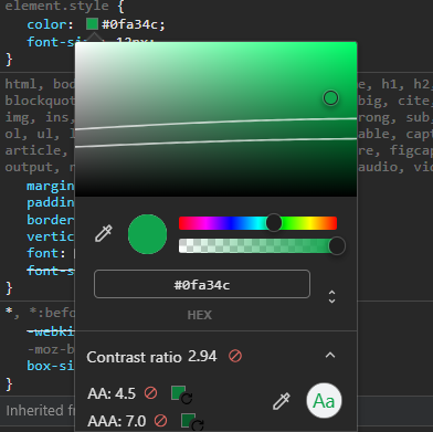
According to the WCAG standard, the minimum number for the contrast ratio is 4.5 which is known as AA, and the ideal number is 7 as AAA. In the case that the font size is 120% to 150% bigger than the default font size, the contrast ratio will be decreased to 3 (AA) and 4.5 (AAA).
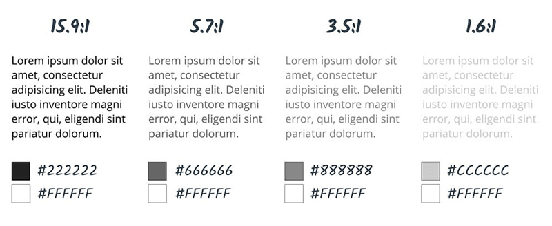
The color contrast ratio 4.5:1 (in minimum) is suitable for people with color recognition problems and the elderlies with the age of 80. This number for the person with a color blindness problem is 7:1 at minimum.
| Text type | AA | AAA |
|---|---|---|
| Text < 24px | 4.5 | 7 |
| Text > 24px | 3 | 4.5 |
| UI (icons, graphs, etc.) | 3 | N/A |
Checking contrast ratio with AA/AAA standard in Google Chrome
In Google Chrome DevTools, it is possible to investigate the contrast ratio of the elements and find the issue. By heading over to the Elements tab, in the Styles section, select a color, so the color picker is opened. If the browser could have distinguished the background color based on the CSS, the contrast ratio level will appear in the color picker box. The passed contrast ratios (AA and AAA) are shown with single or double green check marks ✔ and the failed contrast ratio is presented with a forbidden sign🚫.
Contrast ratio measuring tools based on AA/AAA standard
There are online and offline different contrast ratio checker tools with which you can check if the contrast ratio of a color is passed or not. Here are our recommendations in case of checking your website or UI design accessibility and contrast ratio:
- Google Chrome DevTools (color picker)
- Accessibility Insights for Web Chrome extension
- A11y – Color Contrast Checker Figma plugin
- Contrast Figma plugin
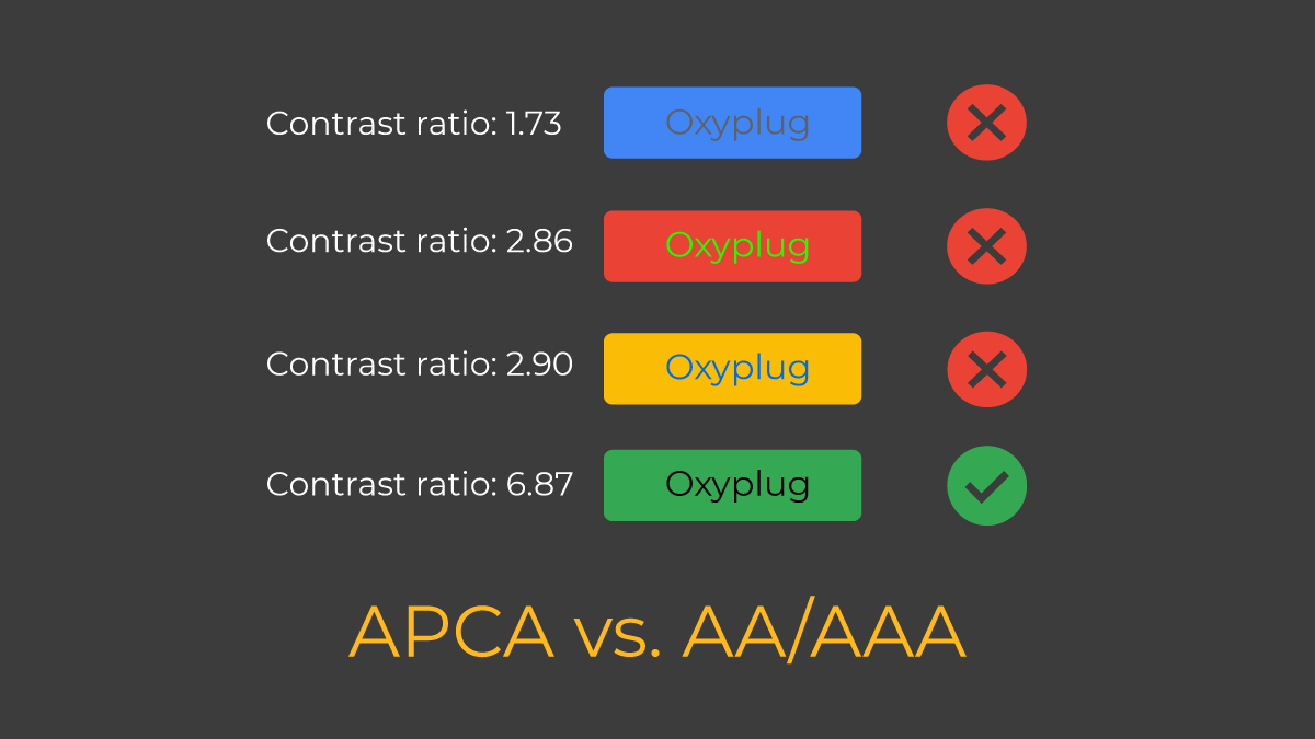
Contrast ratio with APCA standard
Accessible Perceptual Contrast Algorithm (APCA) is another contrast ratio standard that is more accurate than AA/AAA. In addition to the font size and font weight, it considers the text role on the page as well. In the below, you can find the APCA contrast ratio table:
| Font weight | 100 | 200 | 300 | 400 | 500 | 600 | 700 | 800 | 900 |
|---|---|---|---|---|---|---|---|---|---|
| Font Size | |||||||||
| 10px | ⊘ | ⊘ | ⊘ | ©§™ | ©§™ | ©§™ | ©§™ | ⊘ | ⊘ |
| 11px | ⊘ | ⊘ | ⊘ | ©§™ | ©§™ | ©§™ | ©§™ | ⊘ | ⊘ |
| 12px | ⊘ | ⊘ | ©§™ | ©§™ | x100 | x90 | x80 | ⊘ | ⊘ |
| 14px | ⊘ | ⊘ | ©§™ | 100 | 90 | 80 | 60 | x60 | ⊘ |
| 16px | ⊘ | ⊘ | 100 | 90 | 80 | 60 | 55 | x50 | x50 |
| 18px | ⊘ | ⊘ | 90 | 80 | 60 | 55 | 50 | x40 | x40 |
| 24px | ⊘ | 100 | 80 | 60 | 55 | 50 | 40 | 38 | x35 |
| 30px | ⊘ | 90 | 70 | 55 | 50 | 40 | 38 | 35 | 30 |
| 36px | ⊘ | 80 | 60 | 50 | 40 | 38 | 35 | 30 | 25 |
| 48px | 100 | 70 | 55 | 40 | 38 | 35 | 30 | 25 | >20 |
| 60px | 90 | 60 | 50 | 38 | 35 | 30 | 25 | >20 | >20 |
| 72px | 80 | 55 | 40 | 35 | 30 | 25 | >20 | >20 | >20 |
| 96px | 70 | 50 | 35 | 30 | 25 | >20 | >20 | >20 | >20 |
| 120px | 60 | 40 | 30 | 25 | >20 | >20 | >20 | >20 | >20 |
⊘: There should not be any text with this size or weight on a page, just decorative text is allowed.
©§™: There should not be text with this font weight or font size on the page’s content, but it can be used in other non-content usages like Copyright.
x: x-number like x100 means that font size or font weight should not be used in the body of a content on a page. They are better to be used for larger text elements like headlines, titles, or large elements.
<20: It is recommended not to use the text with the mentioned font weight and font size.
Measuring contrast ratio with APCA standard in Google Chrome
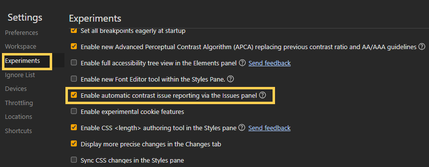
To use the APCA contrast ratio standard in Google Chrome, you need to first enable it by following the steps below:
- Open Google Chrome DevTools using Control+Shift+C or F12 on Windows, Linux, and Chrome OS, or Command+Option+C on macOS.
- Click on the settings icon⚙️on the top left side of the DevTools.
- Click on the Experiments on the left sidebar.
- Enable APCA as shown in the image below.
- Reload the DevTools for the new changes to be applied.
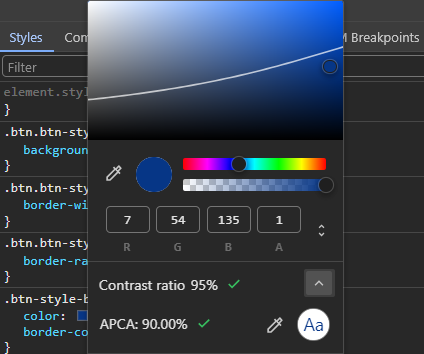
Now, reopen the DevTools and head over to the Elements tab. Click on a color to open the color picker. If the browser could have recognized the background color, then you can see the contrast ratio based on the APCA standard in the color picker.
Contrast ratio audit
As mentioned earlier, it is possible to check an element contrast ratio by using Google Chrome DevTools color picker and some extensions. Now, it is also possible to check the whole page colors’ contrast ratio at once and find the elements that do not pass the acceptable contrast ratio.
To investigate the whole page from a contrast ratio perspective, you can use DevTools and Lighthouse reports that are explained in the rest of the content.
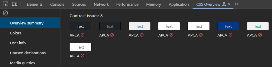
Checking contrast ratio with Google Chrome CSS Overview
By using Google Chrome CSS Overview, you can check the whole page content contrast ratio. To enable this feature on your browser, you can follow the steps below:
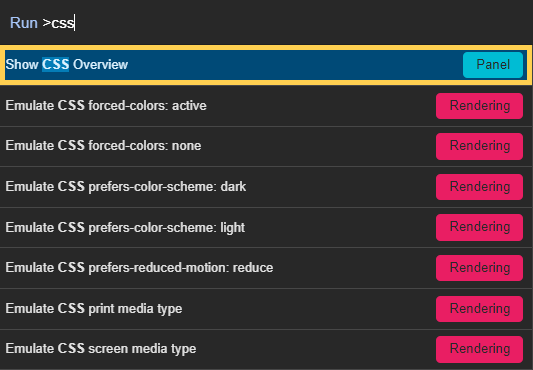
- Open Google Chrome DevTools using Control+Shift+C or F12 on Windows, Linux, and Chrome OS, or Command+Option+C on macOS.
- In DevTools, open Command Palette using Control+Shift+P on Windows, Linux, and Chrome OS or Command+Shift+P on macOS.
- Write CSS and then select Show CSS Overview.
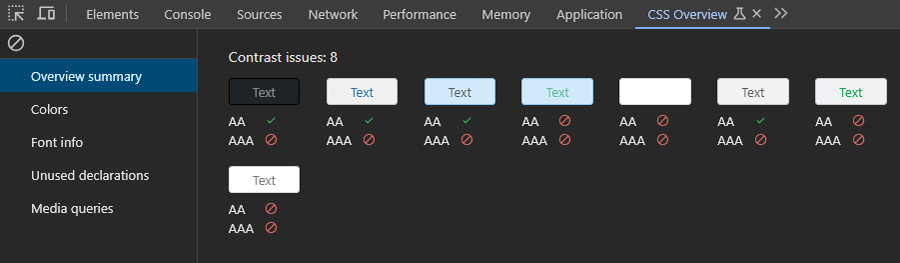
On the CSS Overview tab, click on the “Capture overview” button. Based on the settings you chose as contrast ratio standard (AA/AAA or APCA), the result will be one of the images below:
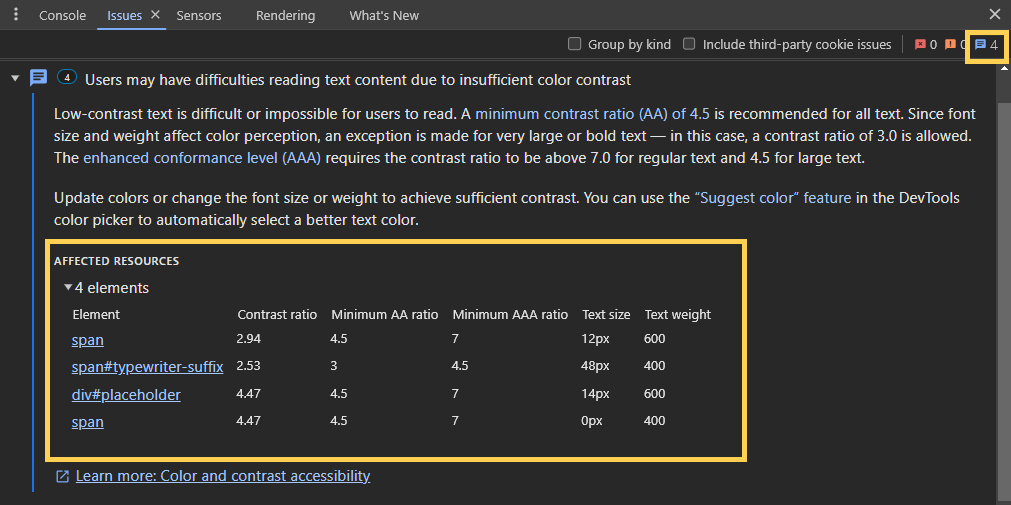
Automatic contrast issue report in Google Chrome DevTools
In Google Chrome DevTools, there is another contrast ratio-related report that shows the contrast ratio issue on a page as a report. To enable this feature:
- Open the DevTools.
- Click on the Settings icon⚙️on the top right side.
- From the left sidebar, head over to the Experiments section.
- Enable automatic contrast issue report as shown in the image below
- Reload the DevTools so that the changes will be applied.
After reloading the DevTools, the number of contrast ratio issues on the top right of the DevTools will be shown if any contrast-related issue exists. By clicking on each issue, you can see the issue details.
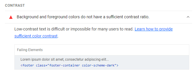
Checking contrast ratio with Google Lighthouse
Google Lighthouse is a free open-source page auditing tool that investigates a page from performance, accessibility, SEO, and PWA aspects and suggests useful tips in the best practices section. By using Lighthouse, you can see probable contrast ratio reports and the elements in the accessibility part.
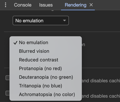
Color blindness emulation in Google Chrome DevTools
As mentioned earlier, nearly 5% of the world’s population is dealing with color blindness. Some of them cannot recognize any color, and the rest are not able to see a specific color spectrum like green, blue, or red. Fortunately in Google Chrome, there is the possibility to emulate color blindness. You can enable this feature by the following steps:
- Open Google Chrome DevTools.
- Press Control+Shift+P keys on Windows, Linux, and Chrome OS or Command+Shift+P keys on macOS to open Command Palette.
- Type “render” and then select Show rendering.
- On the rendering tab, choose the desired option from Emulate vision deficiencies.
Summarize
Besides considering the harmony of colors while UI/UX designing, it is really important to care more about color contrast ratio which is a critical accessibility metric. Providing a better user experience with suitable website visibility from a design perspective for all people should be of high priority.

