Device Pixel Ratio
Due to great progress of devices in the quality of their displays, it is highly demanded to serve images for different devices based on their pixel densities. Before going into details, it is better to get familiar with some basic definitions.
In this article, you will read about:
- What are pixels?
- What is Pixel Density?
- What is devicePixelRatio?
- How to determine the pixel density of your device
- Serve images based on device-pixel-ratios
- How to serve an image based on device-pixel-ratio with <img> tag
- How to serve an image based on device pixel-ratio with <picture> tag
- devicePixelRatios browsers compatibility
- Serving images based on device-pixel-ratio in different libraries
- How to simulate different DPRs in Google Chrome DevTools for testing purposes
What are pixels?
Well, there are some meanings for the concept “Pixel”. Let’s see the most important ones which are used in Web:
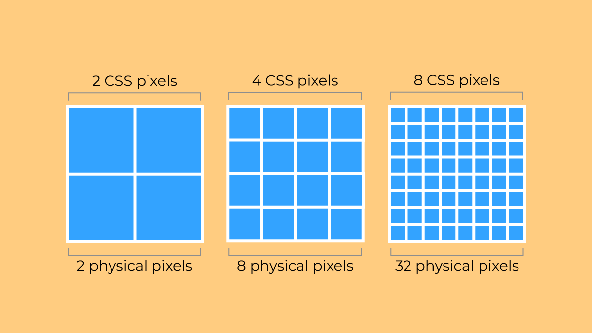
- Device pixel (Physical pixel): It is the smallest dot of color that can be displayed on a device display.
- CSS pixel: it is a unit of physical measurement. 1 pixel equals to 1/96th of 1 inch.
What is Pixel Density?
Pixel density, also known as display density or screen density, calculates the density of pixels per inch on a screen of a device which is measured by ppi (pixel per inch) unit. Pixel density is one of the most important elements of display quality, the higher the screen density is, the better view experience a user can have.
For many years 96 ppi was the most common pixel density in devices and it is still the default dpi of Windows. This screen density started to be increased when Apple released higher display densities for its devices for the first time in 2010. Apple displays pixel density are at least 192 ppi
What is devicePixelRatio?
As the newer devices with different sizes and also shapes came to the market, the device physical pixel is not the same as CSS pixels anymore, so a new context “devicePixelRatio” has been introduced which relates the device physical pixels and CSS pixel. For example a 288ppi device density has the devicePixelRatio of 3 (288ppi/96ppi=3). Here are some popular devices’ pixel-ratios:
| Name | Phys. width and height | CSS width and height | Pixel ratio |
|---|---|---|---|
| Apple iPhone 16 Pro Max | 440 x 956 | 1320 x 2868 | 3 |
| Apple iPhone 15 Pro Max | 1290 x 2796 | 430 x 932 | 3 |
| Apple iPhone 14 Pro Max | 1290 x 2796 | 430 x 932 | 3 |
| Apple iPhone 13 Pro Max | 1284 x 2778 | 428 x 926 | 3 |
| Apple iPhone 12 Pro Max | 1284×2778 | 428×926 | 3 |
| Apple iPhone 12, 12 Pro | 1170×2532 | 390×844 | 3 |
| Apple iPhone 7, iPhone 8 | 750×1334 | 375×667 | 2 |
| Apple iPhone 6+, 6S+, 7+, 8+ | 1080×1920 | 414×736 | 3 |
| Apple iPod Touch | 640×1136 | 320×568 | 2 |
| Samsung S24 | 1080 x 2340 | 360 x 780 | 3 |
| Samsung Galaxy S8+ | 1440×2960 | 360×740 | 4 |
| Samsung Galaxy S7, S7 edge | 1440×2560 | 360×640 | 4 |
| Motorola Nexus 6 | 1440×2560 | 412×690 | 3.5 |
| Sony Xperia Z3 | 1080×1920 | 360×598 | 3 |
| Xiaomi Redmi Note 8T | 1080×2340 | 393×775 | 2.75 |
| Xiaomi Redmi Note 5, 6 | 1080×2160 | 393×739 | 2.75 |
| Blackberry Leap | 720×1280 | 390×695 | 2 |
The device-pixel-ratio is between 1 to 4 and it does not have to be a round number. As an example, Google Pixel 6 device pixel ratio is 2.6.
Your Device Pixel Ratio is:
How to determine the pixel density of your device
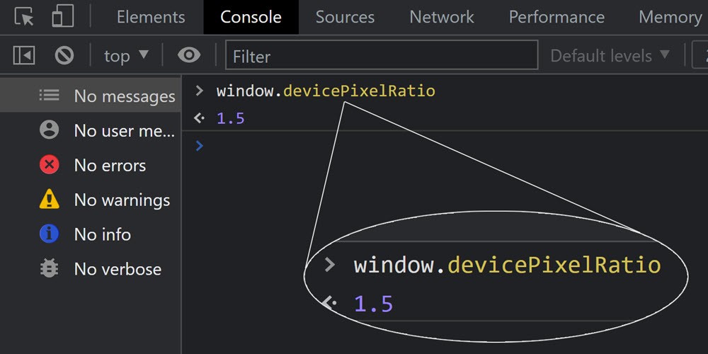
To find out the pixel density of you device, open your browser (Google Chrome, Mozilla FireFox or Microsoft Edge), as shown below, in Console tab type ‘window.devicePixelRatio’, then you will see a number between 1 to 4 which shows the pixel density of you device.
Serve images based on device-pixel-ratios
As mentioned earlier, because of newer displays and their higher resolution in showing images, it is necessary to serve suitable images based on device-pixel-ratios. It means that there should be different sizes of an image which can be loaded based on the screen density by the browsers. One point to consider is that it is important to provide larger images for higher densities and do not enlarge the small images for higher screen densities, because by scaling the small images, their qualities will considerably decrease and if you do not provide suitable image sizes for bigger displays, the browsers do the same thing.
How to serve an image based on device-pixel-ratio with <img> tag
To show images based on device-pixel-ratio, the density descriptors such as 1X, 2X and 3X and the attribute “srcset” should be used together.
By using <img> tag and srcset attribute inside, you are able to have different resolutions of an image, so the browser is able to serve the right image based on DPR (device pixel ratio).
<img src="flower.jpg" srcset="flower-1x.jpg 1x, flower-2x.jpg 2x, flower-3x.jpg 3x">How to serve an image based on device pixel-ratio with <picture> tag
To serve modern image formats like AVIF and WebP while considering device-pixel-ratio, the <picture> tag is a good approach. By using <picture> tag, it is possible to have different image fallbacks with regards to different pixel ratios and browser image format support, so the browser will decide to load the most suitable image based on the HTML element, DPR and image format support.
<picture>
  <source type="image/avif" srcset="/flower-1x.avif, /flower-2x.avif 2x, /flower-3x.avif 3x">
  <source type="image/webp" srcset="/flower-1x.webp, /flower-2x.webp 2x, /flower-3x.webp 3x">
  <source type="image/jpg" srcset="/flower-1x.jpg, /flower-2x.jpg 2x, /flower-3x.jpg 3x">
  <img width="250" height="48" loading="lazy" alt="Flower" srcset="/flower-2x.jpg 2x, /flower-3x.jpg 3x" src="/flower-1x.jpg">
</picture>
As it is shown in the image above, if the different device pixel ratios (1X, 1.5X, 2X, and 3X) are added, so that the browser can understand which image is suitable for which DPR. In addition, it is recommended to bring the pixel density (1X, 1.5X, 2X, and 3X) in the image file name, so it can be easily trackable and understandable for the SEOs, developers or everyone who wants to debug the page. It is not an obligation.
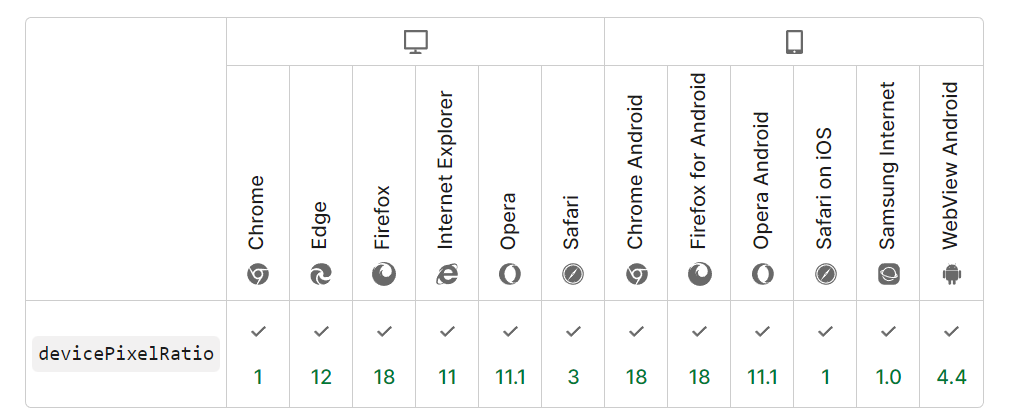
devicePixelRatios browsers compatibility
The main browsers which are used by all users including Google Chrome, Firefox, Opera, Edge and Safari, almost both on desktop and mobile versions, support devicePixelRatios. It means you can generate images based on their pixel densities, and then provide a better view experience for the users.
Serving images based on device-pixel-ratio in different libraries
If you work on JavaScript libraries and want to serve images based on device-pixel-ratio, here are some popular frameworks solutions:
React Native
For serving correctly sized images based on device pixel ratio in React Native library, you can use ‘PixelRatio’.
var image = getImage({
    width: PixelRatio.getPixelSizeForLayoutSize(200),
    height: PixelRatio.getPixelSizeForLayoutSize(100)
}); < Image source = { image } style = { { width: 200, height: 100 } } /> ;Next.js
To serve images based on the device pixel ratio, you can generate different sizes of images and put them into a special folder, e.g. different-resolution which should be located in the /pages folder. In the Netx.js library, the ‘intrinsic’ layout property scales down the container width to the image size. the images will be provided for the browser with the right dimension based on the viewport and device pixel ratio.
import Image from "next/image";
export default function DifferentRes() {
    return ( < Image src = { "https://res.cloudinary.com/ifeomaimoh/image/upload/v1651694150/sea_huykbx.jpg" } height = { 500 } width = { 800 } alt = { "some sample file" } layout = "intrinsic" sizes = "(max-width:3000px) 10vw" / > );
}
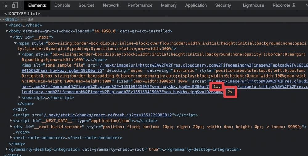
Head over this folder in your browser and see the console in DevTools (Google Chrome browser), you will see the <img> tag and srcset attribute which contains images with different DPRs as shown in the image below.
How to simulate different DPRs in Google Chrome DevTools for testing purposes
Simulating mobile devices is one of the most important steps for testing purposes. Almost all the popular browsers including Google Chrome, Safari, Mozilla FireFox, Opera, and Microsoft Edge provide mobile device simulators for developers. Here, you will learn how to add a special device in Google Chrome with demanded DPR, enable device pixel ratio and test whether the browser loads the right image based on your DPR or not.
How to add a mobile device to Chrome DevTools
By following the steps below, you can learn how to add a predefined or a custom mobile device to the Google Chrome DevTools
Adding predefined mobile device to DevTools
For adding a device which has been already defined in your Chrome browser, you need to follow the steps here:
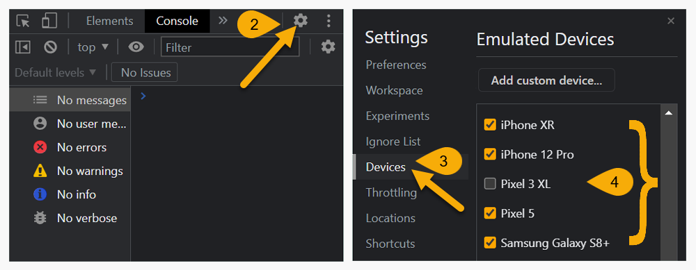
- For opening DevTools in Chrome, press F12 or Command+Option+C (Mac) or Control+Shift+C (Windows, Linux, ChromeOS).
- Press gear icon ⚙️ on the top right corner of DevTools to enter the setting section.
- In the settings section, from the left vertical menu, choose “Devices”.
- Choose the considered devices from the list by marking the checkboxes.
Adding a custom mobile device to DevTools with special DPR
For adding a custom device with the custom device pixel ratio that you prefer, first you need to follow the steps 1 to 3 from above (adding predefined mobile devices section), then continue the next steps here:
- Press on the “Add custom device” button.
- In the opened section, choose a name for your custom device.
- Specify a width and height for your device.
- Specify a DPR (Device Pixel Ratio) for your device.
- Select the device type from the dropdown which is optional.
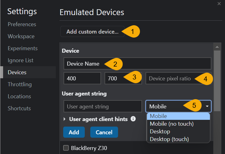

User agent string and user agent client hints which have fields including Brand, Browser version, Platform, Architecture, and Device model are optional and DO NOT have any impact on DPR testing.
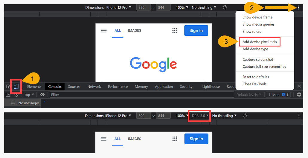
How to enable device pixel ratio in DevTools mobile simulator
Device Pixel Ratio (DPR) is a great option to understand a device’s pixel ratio and to test if the correct image size is loading for that DPR or not. For enabling device pixel ratio, first you need to open DevTools as previously mentioned by perssingF12 or Command+Option+C (Mac) or Control+Shift+C (Windows, Linux, ChromeOS).
- Click on the Toggle Device Toolbar on the left top corner in DevTools.
- Click on the ⋮ icon on the top right corner.
- Select “Add device pixel ratio”.
Conclusion
As the new devices come to markets, we all expect better resolution and device density, so it is important to respect these display improvements by serving images based on device pixel ratio (DPR). To serve images based on DPRs, using <img> or <picture> tag is the solution. In different website platforms and libraries, there are some solutions to be performed for serving right images for different display densities. In WordPress, the Oxy Image plugin is a good solution which provides the opportunity to serve suitable image resolution and format using <picture> tag.